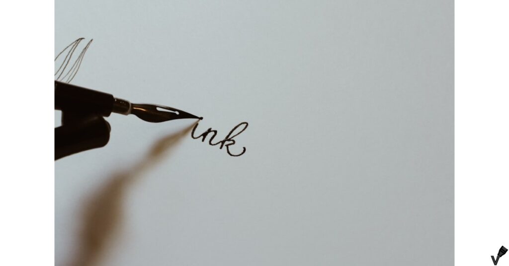
Introduction
In my opinion, choosing the right markers for calligraphy and hand lettering is crucial. When I first started, I thought any marker would do, but I quickly learned that not all markers are created equal. The difference between a mediocre marker and a high-quality one can be night and day. It’s not just about the ink, but the feel, the control, and the consistency each pen offers. Why is this important? Because the right tools can elevate your work from amateur to professional.
In this guide, I’ll share my personal experiences and insights on the best markers for calligraphy and hand lettering. We’ll explore various types of tips, like brush, chisel, and fine, and discuss why each one is suited for different styles and techniques. I’ll also touch on ink flow and consistency, which are key to achieving those smooth, beautiful lines we all strive for.
What does this mean for us? Simply put, understanding these elements will help you make informed choices and improve your calligraphy skills. Whether you’re just starting out or looking to upgrade your tools, this guide will provide practical advice and recommendations to enhance your artistic journey. Let’s dive in and discover the markers that will make your lettering truly shine.
Key Features to Look For
Selecting the right markers for calligraphy and hand lettering is like choosing a dance partner. The right fit can make your art flow effortlessly, while the wrong one can trip you up at every step. Having tried a myriad of markers, I’ve learned that understanding key features is essential. So, let’s delve into tip types and ink flow, two critical aspects of calligraphy markers.
The Tip Type
First off, the tip type can dramatically impact your lettering style. Brush tips are my personal favorite. They offer a flexible, dynamic range of line widths, perfect for creating those elegant, sweeping strokes. The ability to switch from a thin, delicate line to a bold, thick stroke with just a change in pressure is priceless. But, if precision is what you’re after, fine tips are a godsend. They provide unparalleled control, allowing for meticulous detail work. I often use them for intricate designs and fine flourishes. Have you ever tried drawing delicate patterns with a brush tip? First time I tried it I was using the Ohuhu Dual Brush Fineliner and it was a nightmare.

Then there’s the chisel tip, which I find particularly useful for structured styles like gothic or blackletter. The sharp edges help in achieving those crisp, angular lines. It took me some time to get the hang of it, but once I did, it opened up a whole new style of lettering. Why is this variety in tip types important? Because each project might demand a different approach, and having the right tool can make all the difference.
Ink Flow and consistency
Ink flow and consistency are equally crucial. In my experience, nothing ruins a piece faster than inconsistent ink flow. I remember working on a project, and the ink kept skipping, leaving gaps and making my lines look uneven. That’s why I now test markers before diving into a project. The best markers provide a smooth, consistent flow, ensuring that every stroke is clean and uniform. Why does this matter? Because smooth ink flow allows you to focus on your creativity, not on fighting with your tools.
Consistent ink flow also ensures that the colors are vibrant and even. There’s nothing worse than a marker that starts strong but fades halfway through a stroke. I’ve found that markers with high-quality, pigment-based ink tend to perform the best. They stay bold and bright, making your work pop off the page.
Understanding these features – tip types and ink flow – is vital for anyone serious about calligraphy and hand lettering. Having the right tools transforms your work from good to great. So, whether you’re just starting out or looking to refine your skills, take the time to choose your markers wisely. What does this mean for us? Simply put, it means we can focus on the joy of creating beautiful art, knowing our tools won’t let us down.
Top Marker Recommendations
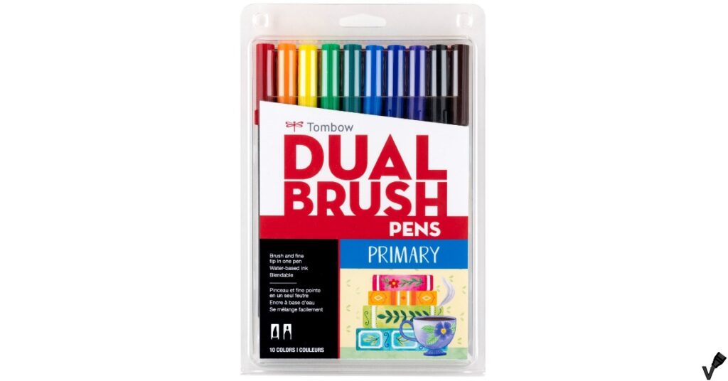
Tombow Dual Brush Pens
Overview
- Dual tips: One end is a flexible brush tip for bold strokes, and the other end is a fine tip for detailed work.
- Water-based ink: The ink is blendable and can be used for watercolor effects.
- Self-cleaning tips: After blending colors, the tips clean themselves.
- Vibrant colors: The primary set includes bright, vibrant colors.
- Non-toxic: Safe for kids and adults.
- Acid-free: Ideal for archival quality projects.
Pros vs Cons
Pros
- Vibrant and Versatile Colors
- Easy to Control for Beginners
- Good Blending Capability
- Non-Toxic and Safe for Kids
- Self-Cleaning Tips
Cons
- Pricey Compared to Other Brands
- Blending Limitations with Some Colors
- Limited Color Range in Basic Sets
- Not Ideal for All Paper Types
- Tricky Blending Pen Use
Short Analysis
In my experience, there’s nothing quite like the feel of a good marker gliding across the page, especially when it comes to calligraphy and hand lettering. I’ve tried many, but Tombow Dual Brush Pens have a special place in my collection. Why? Well, let me explain.
First off, the versatility is amazing. With a dual tip, you get both a flexible brush tip for sweeping strokes and a fine tip for precise details. This makes them perfect for everything from bold headers to intricate flourishes. I often find myself switching between tips in a single project, and it’s seamless.
Now, let’s talk about colors. Tombow offers a dazzling array of hues that blend beautifully. I remember the first time I tried blending; it was like discovering a new dimension in my work. The water-based ink allows for smooth transitions and gradients, adding depth and interest to every piece.
But it’s not just the technical aspects that make these pens stand out. For me, using Tombow Dual Brush Pens is about the experience. The way they feel in my hand, the satisfaction of a perfectly executed line—it’s almost therapeutic. Who wouldn’t want their art supplies to bring a bit of joy?
In my opinion, if you’re serious about calligraphy or hand lettering, investing in a set of Tombow Dual Brush Pens is a no-brainer. They’ve elevated my work and made the process more enjoyable. What’s not to love?
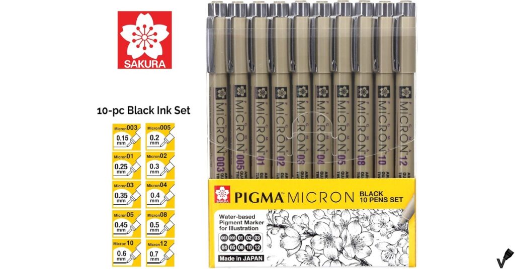
Sakura Pigma Micron Pens
Overview
- Waterproof Ink: Ideal for artworks that require longevity and resistance to moisture.
- Variety of Tip Sizes: A range of tip sizes caters to different drawing needs.
- Pigment Quality: The ink is rich and vivid, enhancing the overall quality of artwork.
- Versatility: Suitable for various art forms including drafting and architectural sketches.
- Quick-Drying: Minimizes smudging, crucial for intricate designs.
- Longevity: Designed to last longer without drying out quickly.
Pros vs Cons
Pros
- Exceptional Waterproof Quality
- Perfect Pigment Quality
- Versatile Tip Sizes
- Great for Beginners and Professionals
- Value for Money
Cons
- Inconsistency in Pen Quality
- Occasional Ink Flow Issues
Short Analysis
When I first stumbled upon Sakura Pigma Micron Pens, I wasn’t prepared for how much they’d change my approach to lettering. Why are these pens so special? Let me share my thoughts.
One of the standout features is their precision. The fine tips come in various sizes, from ultra-thin to thicker lines, allowing for incredible detail in my work. I’ve noticed that my letters look cleaner and more professional since I started using them. Have you ever tried to achieve a perfect, consistent line with a lesser pen? It’s frustrating, to say the least.
The ink quality is another game-changer. It’s archival, waterproof, and fade-resistant, which means my pieces stay vibrant and crisp over time. I remember one project where I used a different pen, only to see my hard work smudge and fade. With Sakura Pigma Micron Pens, I never have to worry about that.
In my experience, the feel of these pens is also noteworthy. They fit comfortably in my hand, reducing fatigue during long sessions. This might seem minor, but for someone who spends hours perfecting each stroke, it makes a huge difference.
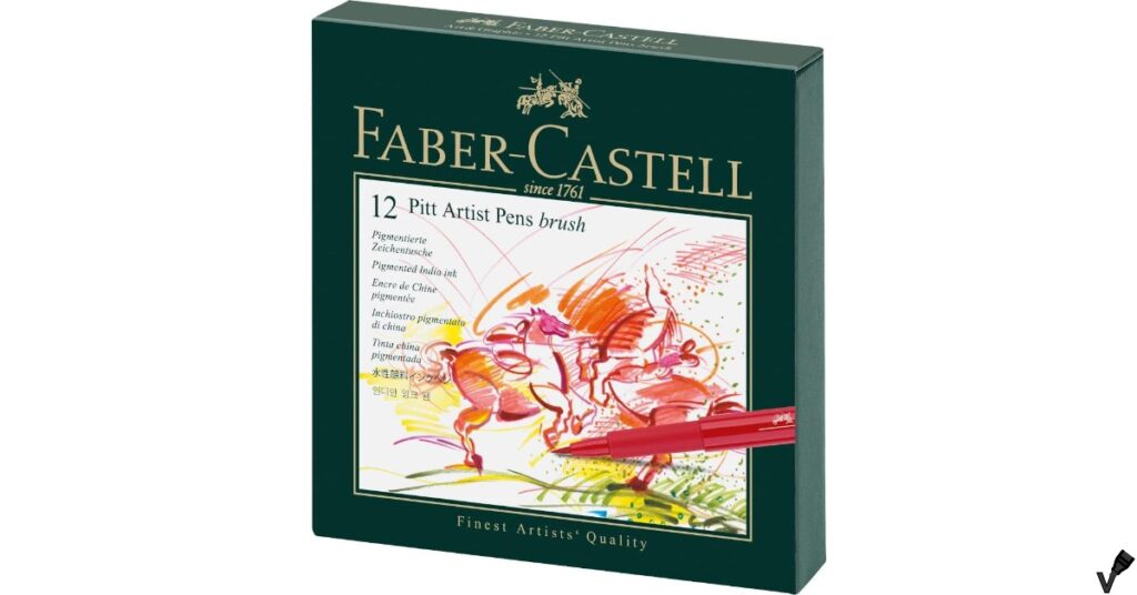
Faber-Castell Pitt Artist Pens
Overview
- High-quality India ink: These pens use waterproof India ink that’s known for its durability and vibrant colors.
- Variety of nibs: The set includes different nibs such as brush, fine, medium, and bold, catering to various artistic needs.
- Acid-free and archival: Ensures that your artwork remains pristine over time without any fading.
- Odorless and non-toxic: Safe for use by artists of all ages.
- Wide color range: Available in a spectrum of rich and vivid colors.
- No bleed-through: Ideal for use in journals and sketchbooks as the ink doesn’t bleed through most papers.
Pros vs Cons
Pros
- Vibrant Colors and High-Quality Ink
- Versatile Nibs
- No Bleed-Through
Cons
- Stiff Brush Tip
- Pricey
- Fraying on Rough Paper
Short Analysis
Faber-Castell Pitt Artist Pens are an absolute game-changer for calligraphy and hand lettering. I remember the first time I held one of these pens; it felt like magic. But what makes them so special? Let me share my experience.
Firstly, the quality of the ink is remarkable. It’s India ink, which means it’s waterproof, smudge-proof, and highly pigmented. I’ve tried other pens before, only to be disappointed by the ink bleeding through the paper or fading over time. With Faber-Castell Pitt Artist Pens, my work stays vibrant and sharp, even after months.
The variety of nibs these pens offer is another reason I love them. Whether you need a fine tip for delicate details or a brush tip for bold strokes, they’ve got you covered. I often find myself switching between nibs within the same project, and it’s incredibly convenient. Have you ever tried to achieve delicate lines and bold strokes with the same pen? It’s nearly impossible without these versatile nibs.
In my experience, the durability of these pens is also worth mentioning. They last much longer than other brands I’ve used, saving me both time and money in the long run. And the pens feel sturdy in my hand, making the whole lettering process more comfortable.
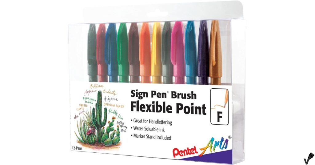
Pentel Sign Pen Brush Tip
Overview
- Flexible Brush Tip: Designed to create both fine and broad strokes, perfect for calligraphy and detailed illustrations.
- Vibrant Colors: Available in a variety of bright and bold colors.
- Smooth Ink Flow: Ensures consistent lines without skips.
- Portable and Lightweight: Easy to carry around for on-the-go sketching.
- Non-toxic and Acid-free: Safe for all ages and ensures longevity of artwork.
Pros vs Cons
Pros
- Vibrant Colors and High-Quality Ink
- Flexible Brush Tip
- Easy to Use
Cons
- Pricey
- Inconsistent Labeling
- Bleed-Through on Thin Paper
Short Analysis
In my opinion, the Pentel Sign Pen Brush Tip is a true gem for calligraphy and hand lettering enthusiasts. When I first tried these pens, I was struck by how seamlessly they enhanced my creative process. What makes these pens stand out? Let me share my thoughts.
The brush tip is incredibly responsive. It effortlessly switches between thin and thick lines with just a change in pressure. I remember practicing my strokes and being amazed at the control I had. Have you ever tried to get those perfect transitions with a stiff pen? It’s frustrating, to say the least. With the Pentel Sign Pen, it’s like the pen dances across the paper.
Another highlight is the ink flow. It’s consistent and smooth, with no annoying skips or blobs. I’ve worked with other pens that left me dealing with ink splotches or uneven lines. Not these. The vibrant, rich ink of the Pentel Sign Pen Brush Tip makes every letter pop off the page.
In my experience, these pens are also incredibly durable. Despite their fine tip, they hold up well over time, which isn’t something I can say for many other brands I’ve tried. They’re reliable, and that reliability lets me focus on my art rather than my tools.
Calligraphy Techniques and Tips
Mastering calligraphy is one of the most satisfying artistic pursuits. The delicate dance of pen and paper, the smooth transitions from thin to thick lines, it’s all a beautiful blend of precision and creativity. Let me share some calligraphy techniques and tips that have transformed my own lettering journey.

When I first started, the basic strokes seemed deceptively simple. Thin upstrokes, thick downstrokes – how hard could it be, right? But, as I quickly learned, these foundational strokes are the building blocks of every letter. In my experience, spending time practicing these basics is crucial. I found that using a grid or guide sheets helped immensely in maintaining uniformity. Why is this important? Because consistency in strokes leads to more cohesive and aesthetically pleasing letters.
Speaking of consistency, one technique that worked wonders for me is the drill of repeating basic shapes over and over. Ovals, loops, and lines. It might sound tedious, but this practice builds muscle memory. I remember my first attempts were shaky and uneven, but with time, my hand grew steadier. Have you ever noticed how a professional calligrapher’s strokes look almost effortless? That’s the result of relentless practice.
When it comes to lettering styles, experimenting can be both fun and educational. I started with the classic copperplate style, known for its elegance and precision. The strict guidelines taught me discipline. Then, I moved on to more modern styles, like brush lettering. The freedom and flow of brush pens were a refreshing change. In my opinion, dabbling in different styles not only keeps things interesting but also improves your adaptability and skill set.
Practicing control is another key aspect. I found that holding the pen at a consistent angle, usually around 45 degrees, made a significant difference in the quality of my lines. Also, using my arm instead of just my wrist to move the pen helped in achieving smoother strokes. Control isn’t just about the hand, it’s about the whole posture. Sitting comfortably, with good lighting, and using quality paper all contribute to better control.
Why does this matter? Because calligraphy isn’t just about creating beautiful letters, it’s also about the joy of the process. The meditative practice of perfecting each stroke, the satisfaction of seeing improvement, it’s all part of the journey. For anyone serious about calligraphy, my advice is to embrace the basics, practice consistently, and don’t be afraid to explore different styles. Each step, no matter how small, brings you closer to mastery.
In my experience, calligraphy is a blend of art and discipline. It requires patience, practice, and a passion for detail. But the rewards – the ability to create something truly beautiful with just a pen and paper – are well worth the effort. So, pick up that pen, and let your creativity flow. What does this mean for us? Simply, it means we can turn everyday writing into an art form, one stroke at a time.
Maintaining Your Calligraphy Markers
Maintaining your calligraphy markers is as important as mastering the strokes. I’ve learned through trial and error that a well-kept tool can make a world of difference in your work. So, let’s dive into some practical tips on cleaning, storage, replacing nibs, and refilling ink.
Firstly, cleaning your markers is crucial. I’ve found that regular cleaning prevents ink from drying up and clogging the nib. After each session, I gently wipe the nibs with a damp cloth. For stubborn ink, a bit of water and a soft brush work wonders. Have you ever tried to write with a clogged pen? It’s frustrating and can ruin your piece. By keeping the nibs clean, you ensure a smooth flow of ink every time.
Storage is another area where I’ve made a few mistakes. I used to store my markers vertically, but I noticed the ink would either flood the nib or dry out. In my experience, storing them horizontally balances the ink distribution. Also, keeping them capped tightly is a no-brainer. Why is this important? Because proper storage extends the life of your markers, saving you from frequent replacements and frustration.
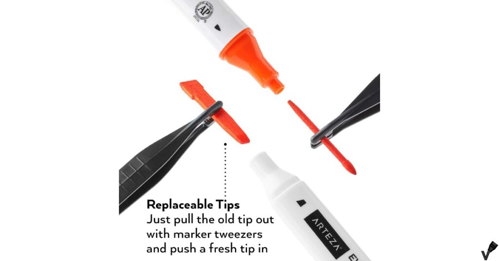
Replacing nibs might seem daunting at first, but it’s quite straightforward. When I notice the nibs getting frayed or losing their sharpness, I know it’s time for a change. Most markers have easily replaceable nibs – you just pull out the old one and pop in the new. It’s like giving your pen a fresh start. What does this mean for us? It means consistently crisp lines and a smoother writing experience.
Refilling ink is another skill I’ve picked up. It’s more economical and environmentally friendly than buying new markers all the time. Depending on the brand, you can find compatible ink refills. For markers with removable ink cartridges, it’s as simple as swapping the old for the new. For others, like brush pens, you might need a syringe to refill directly. The first time I tried it, I was a bit nervous, but it turned out to be quite easy and satisfying.
In my opinion, maintaining your calligraphy markers is about respecting your tools and your craft. By keeping them clean, storing them properly, replacing nibs when needed, and refilling ink, you ensure that your markers are always ready to deliver their best performance. Why does this matter? Because when your tools are in top shape, you can focus on what truly matters – creating beautiful, expressive calligraphy. For anyone serious about their craft, these maintenance tips are not just recommendations; they’re essential practices that enhance both your experience and your work.
Final Thoughts
The journey of mastering calligraphy and hand lettering is a rewarding blend of art and discipline. Reflecting on the key points, choosing the right markers can make all the difference. The type of tip – whether brush, chisel, or fine – shapes your style and dictates the fluidity of your strokes. Equally important is the ink flow, ensuring consistency and vibrancy in your work.
From my experience, investing in quality markers is essential. They provide the reliability and precision needed to perfect your technique. But beyond the tools, practice is the true path to improvement. I remember my early days, filled with uneven lines and shaky hands. But with persistent practice, those wobbly lines transformed into graceful strokes. Why is this important? Because each practice session builds your muscle memory and hones your skills, bringing you closer to mastery.
So, what does this mean for us? It means embracing the process, enjoying the practice, and continually challenging ourselves to improve. Calligraphy and hand lettering are not just about the end result, but the joy found in each careful stroke and flourish. Keep experimenting, stay patient, and let your creativity flow. In my opinion, there’s nothing quite like the satisfaction of seeing your progress on paper.
Frequently Asked Questions
-
What are the best markers for calligraphy and hand lettering?
Some of the best markers for calligraphy and hand lettering include the Tombow Dual Brush Pens, Faber-Castell Pitt Artist Pens, Pentel Fude Touch Sign Pen, and the Sakura Pigma Micron. These markers are known for their flexibility, vibrant colors, and ease of use. -
What makes Tombow Dual Brush Pens ideal for hand lettering?
Tombow Dual Brush Pens feature a flexible brush tip for bold strokes and a fine tip for detailed work, making them versatile for both calligraphy and hand lettering. They are also blendable, allowing artists to create gradient effects with ease. -
How do Faber-Castell Pitt Artist Pens perform in calligraphy?
Faber-Castell Pitt Artist Pens are known for their high-quality India ink, which is waterproof, fade-resistant, and acid-free. Their flexible nibs allow for a variety of line widths, making them perfect for calligraphy and hand lettering. -
Can beginners use the Pentel Fude Touch Sign Pen for calligraphy?
Yes, the Pentel Fude Touch Sign Pen is suitable for beginners. Its flexible yet firm brush tip provides good control, making it easier to learn the thin and thick stroke techniques essential for calligraphy. -
What should I consider when choosing markers for hand lettering?
When choosing markers for hand lettering, consider the flexibility of the nib, the vibrancy and blendability of the ink, and the overall ease of use. Additionally, consider whether the markers are waterproof and fade-resistant to ensure the longevity of your work.